Essence Of Colour
- Sehaj Singh

- Sep 7, 2020
- 6 min read
Updated: Nov 30, 2020
On 9 September we started with our new project based on colours and its use and feelings associated with them.
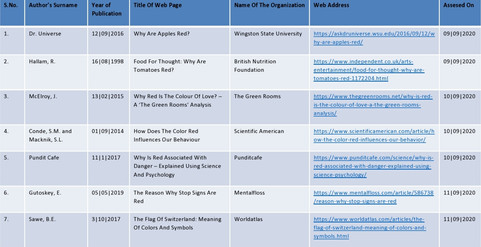
The project started with the Pre-task. In which we were used to collecting 25 items of the colours assigned to everyone. I got the colour Red. The objects we need to collect must have red colour.naturally and from long term associated.
The 25 items which I chose are -

After that, on Day 1 we told to make swatches of the colours of all the objects and try to find that red colour from the selected objects. Na d also to mention we feel something with the other trial swatches.
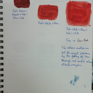
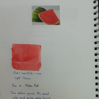
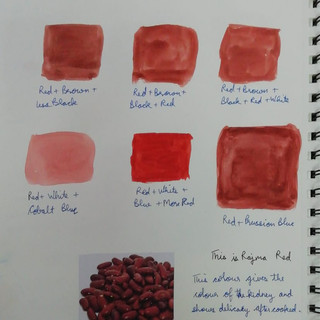
I made 10 of them on Day 1. They are -
Apple
Tomato
Red Chilly
Pomegranate
Jam
Ketchup
LPG Gas Cylinder
Red Capsicum
End Call Sign
Youtube Sign


Then On Day 2 We Completed all 25 swatches and wrote tour feelings associated with each obtained colour. They are -
Watermelon
Kidney Beans
Red Mushroom
Litchi
Flag Of Switzerland
Medical Sign
Carrots
Red Rose
Airtel Sign
Hibiscus
Fire Extinguisher
Lady Bug
Plums
Poppy
Strawberries


And there was a discussion upon the colours and I said this in the discussion -
I observed the colour is the main thing which makes happy when using light colours and dark colours look opposite. We use colours to make situations similar to what is happening. Like using dark circles in shoes to show speed like a leopard.
The colour also helps in representing the personality of a person. In females some use light shade nail paints, some use pink or red colour dresses, and few like darker colours which appear differently.
The colour in food also changes with the season. Like using warm colour food in the summers and using dark mushroom colours in winters.
Adding to this information I would like to add the reason for the colour attraction. The red colour has a maximum wavelength so it appears fast the violet which has a minimum wavelength. So that's why bright colours always attract and dark less like dark colours observe other colours.
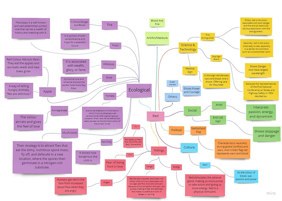
On Day 3 We were told to make the list of my objects and feelings and finally the mind map of The colour red in the group. We were said to make a chart showing fellings with a particular object. And my group members are - Soudeep And Nandini. This is what we made -

Our Mind Map -

After that, we were told to make this chart individually with my own list.
My List -
Numbering can be seen in the above list-


And My Mind Map Is -
Day 4 is started with a discussion on the video of how the colours are used in movie making. The video which was shown was on the movie Joker, how the colours are with different hues, saturation, intensity, and brightness.
After the brief, we were given a task to select a movie of my choice to identify and discuss the impact of my assigned colour on a particular scene & movie.
So for this task, I used Scenes of 5 different movies and expressing Horror Feeling.
1. Suspiria - In this movie scene we can see a lady who is scared of some ghosts. The red colour is showing danger and emergency. There is a lighter shade on the lady and darker on the curtain and blue behind. This lady is enhanced with different tones. The light red showing that weakness and fear of the lady.

2. Beyond The Black Rainbow - In this movie scene we can see a man who is the ghost/villain. The red colour is giving the feeling of fear and blood. There is a tonal variation on the face and sides and there is also black shade giving more focus on the face.

3. Total Recall - In this movie scene we can see a man with his face open and the colour is matching with the background and showing the suffering and suffocation in the current situation. There is some yellowish tone giving the feel of danger and blood.

4. Batman - In this movie scene we can the hero batman but its more looking like the villain. The red colour shows bravery as well as danger. There is a very good use of dark red and light red on the face to enhance the person the black mask gives a more scary tone. This scene both faces of the batman.

5. Star Wars: Episode IV A New Hope - In this movie scene we can see there is a man which is shown very brave. The red colour in the background showing a battlefield and the face having darker shade giving the feel of more danger and power from that person.

Reflection Of The Day 4 (Learning From Peers)
After listening to all the 4 chapter notes from every student helped in understanding particular topics clearly. There is one major reflection from the learning was that these chapters were somehow interconnected with each other. In the first chapter, we got to know about the colour usage in the cultures and their symbolism and the facts behind using that particular colour/object only. The whole chapter was narrated by Berlin And Kay. For example, For showing fear North America uses more red and black colours than other countries. In the second readings, we get to know about the psychology of colours in cultures. How emotions are associated with a particular colour. Like why the green colour is associated with Hulk. Chapter 3 was what I got to explain. In this chapter, I showed that the definition of colour, Different models of colours (Like RGB, CMYK, and Colour Wheel). Then We get to know how to add tones, tint, and shades, Then I showed the Colour Schemes which are mainly used. This I explained with many examples in my notes. Then in chapter 4, we got to learn about the role of different colours in different age groups, uses, and roles of colours in marketing. In the future, I will try my best to remember the colour schemes, colours of various cultures, cartoons, etc. and what are colour choices according to the age. This was the very important learning about the colours because this the main thing that gives attraction, emotions, and symbolism.
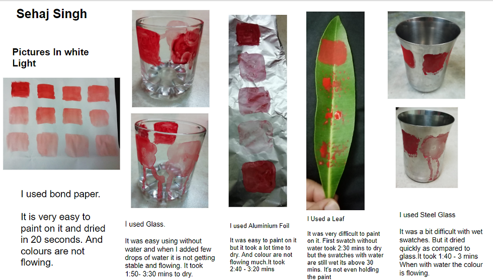
Day 4 started with a new type of brief and activity. In this activity, we needed to collect items pieces of different materials such as paper, metal, glass, etc. to explore the response of colour and colour medium on them.
After that, we were told to apply the assigned colours to the types of surfaces and to find answers to the following questions:
How colour behaves on different materials and surfaces?
How colour behaves under different light sources and conditions?
How one colour visually interacts with other colours?
How the perception of meaning/communication of colour change with the density of pigment?
So This Is what I did -

After that ma'am told us how to show the 3rd question and I did this -


In the first picture, the Yellow Orche colour is having a tone like the Red colour and giving a very low contrast. But when we see the swatch in which lemon yellow is in the background of the red which makes the focus on red and has high contrast and in the swatch with chrome yellow, it is giving a moderate contrast.
In the second picture, only the first and last swatches are giving the high contrast rest are not. The colour red feels like trapped in the cage of a blue colour.
In the third picture, only the first swatch is giving some contrasts otherwise in the rest of the swatches they are giving very fewer contrasts and feels like getting mixed with the red.
Day 4 started with sharing the responses we received from the survey we all had taken from 15 people.
After that, we were told to write a reflection note of 300 words based on the knowledge of colour, you have gained through: (a) Colour Extraction: intuitive when you have made the swatches; (b) Context, aspects & associations of Colour: while finding answers to your questions; (c) Readings and Movies.
Reflection On Knowledge Of Colours
By this project, I got to learn about the basics of colours and the terms related to it. On 1st day, of the project, I got to learn how to use poster colours and how to mix colours on the palette, how to make the colour swatches, how to get a colour swatch of the natural and man-made objects. We experimented a lot with different colours and got to know how to get darker and lighter shades of colours like, to make the colour swatch of the apple red I tried to mix red with yellow, red with brown, then I was not able to get then I asked my teachers and got to know how to get dark colour in red by adding little blue or black. On 2nd day, I got to relate the colours with emotions/feelings. I got to learn about how colours are used in brands. On 3rd day I learned why something is associated with that particular thing means the scientific reasons and the long term associations. Through the home tasks, we get to a lot of information about colours like the general design terms for colours, how colours associated with cultures and the people of different age groups. On 4th day I learned how colours are used in the movies. How they change the brightness, intensity, contrasts, background colours, temperature, etc. On 5th day I learned how colour behaves on different surfaces, different light source, how perception changes with density, how colours visually interact with other colours. On 6th day I got to learn how people perceive the colours, why their thinking is different from the designers and general knowledge of the people. From the overall project, I have now started perceiving colours in a way designers think.
Feedback
I got the mid and last feedback and rubrics as follows -


Comments